Original photos of edited
Kirha's Photography
Tuesday, 1 February 2011
Evaluation
What my work is about
My work is mainly about having fun and showing my personality through images.
At the start i had no idea what i was aiming for and now i have finished i still don't know what i was aiming for.
How my idea developed
My idea developed from sweets, it hasn't really changed apart from it's more about friends. I could of changed it alot by changing my idea. The reason why i didn't change it is because i didn't know how my work would turn out in the end.
Equipment and techniques i used
The equipment i used was my Nikon D60 camera, natural lighting and in some photographs a lamp.
I didn't use a tripod because i didn't have one until the end of the course. My images could of turned out a lot better if i did use a tripod.
I didn't use many techniques apart from using aperture control, i liked using this because it let a lot more light in than the settings i was already using.
Problems i encountered and what i did to to solve them
I encountered a lot of problems. My main problem was my models not turning up also not turning up on time, i managed to solve this problem by finding friends who are more reliable.
Two artists that have influenced/relate to my work
Personally i don't think any artisits influenced me apart from Jane Bown she relates to my work by using natural lighting because most of my photos i used natural lighting. Another artist is David Hockney his edited photos are quite unusual, he influenced me by being out of the ordinary and do something that is unusual yet simple.
Am i pleased with my final piece?
No. I know i can do better, i have taken photographs before college that are a lot better than my final piece. If i could do this course all over again i would choose an easier theme and plan it all out before i start it, this is because i didn't plan anything i did, and it shows in my final images.
Wednesday, 26 January 2011
Introduction To Unit 107 (Presenting Photo Images)
This unit is to show the ways of presenting our work.
There are many ways of presenting photographs like:
There are many ways of presenting photographs like:
- Mounting
- Framing
- Showing it in a slideshow
If you are doing it for your own home you can present them:
- On a canvas
- Mug
- Mouse mat
and many other things.
Initial Ideas
The problem with me is that i don't plan ahead, i just go out and do it. Which does make me mess up a lot, also i'm not good at thinking of ideas in such a limited time.
So far i am still sticking to the sweets and people theme, yet i am thinking of more along the line of friends as a theme as it is rather hard to find sweets big enough to show in photographs.
I have now found myself a new memory card so i wont have the trouble of taking photos and losing them.
I was going to also use people who wear alternative clothing but i don't have many friends who wear those kind of clothes and the ones that do are camera shy.
Photoshop Task
In class we were taught how to change coloured photographs into black and white, also how to turn a photograph from colour to sepia.
I don't use photoshop because it's too expensive to buy, i use GIMP it's a simpler version of photoshop.
Before
After
How i did it
I opened up gimp and opened up my image.
I clicked on Colors then selected Colour Balance i just played around with the settings until i was happy with the outcome.
Unfortunately i didn't realise until i finished editing this photograph that it was actually taken on my Sony Erricson K800i.
How i did it
I opened my image and selected the lasso tool and trace around the baby and the background so all of the background is selected.
I then clicked on Colours then selected Colourize.
I then played around with the settings until it went black and white.
Accidents happen
There is a reason why there isn't a before. Once i finished editing my image i accidentally saved over the original image.
Before
After
With this photo i duplicated the original image.
The copied image, i messed around with brightness-contrast until i had 3 strong colours.
Next i turned it black and white by pressing colors-desaturate.
Once i did that i right clicked on the layer and selected Add Alpha.
After i had done that i clicked on the erase tool and erased the black and white from the lollypop.
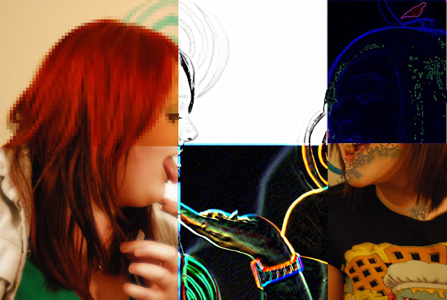
With this image i was trying out filters.
To get to filters on Gimp you click filters and then just tested them out to see which ones you like.
Starting with the top left square.
This filter is pixelate, it simplifies the image into an array of solid - coloured squares.
Bottom left is soft glow this just simply adds a soft glow to the image, you can also choose how strong the glow is.
Top center is sketch, this simply makes your image look as if someone has sketched it.
Bottom center is neon glow.
Top right Predator, it adds a predator look to the selected region (or alpha)
Bottom right is a coffee stain, it adds a realistic coffee stain to the image.
Aperture and Composition Task
Aperture Control
Fast Shutter Speed
10/1250 second
F/14.0
38 mm
800

Slow Shutter Speed
These pictures have turned out worse than i expected, the lighting was really bad because i was using natural lighting and it was a very dull day, yet i am happy with the photos because i captured using fast and slow shutter speed.
Narrow Depth of Field
This is my attempt at doing Narrow Depth of Field. What narrow depth of field is where part of the photo is in focus and using a low f number on the camera settings.
Wide Depth of Field
This is my attempt at doing Wide Depth of Field.
What wide depth of field is where everything is in focus and using high f numbers on the camera settings.
Composition
Colour
The reason why i chose this picture is because of how vibrant the colours are.
I'm really shocked how well the colour came out because the day i took this photo it was raining and very dull.
Distance
NIKON D60
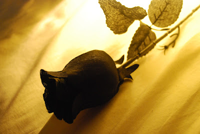
Shadow/light

This is one of the best photographs i have taken. Personally i think i got the right amount of light and shadow to make this photo great. All i did was put a plastic rose on my pillow and lay a lamp and the bottom of the stem so the light was shining towards the rose bud.
I could of made this picture better by making the pillow have less creases in it.
Evaluation
For the composition task i did have to use old photos i had done on my camera because my memory card was corrupted and was telling me i had no photos on my camera even though i had just taken a photo, which did put me back with my work.
Monday, 24 January 2011
Introduction
Level 1 VRQ Qualifications in Photo Imaging
The assignments i have chosen to do are Assignment 105: Introduction to image capture of people and Assignment 108: Digital image manipulation.
Assignment 105
This assignment gives us the opportunity to show that we can use camera skills in recording images.
This includes producing a minimum of 6 thematic image of people by using the right and appropriate equipment, capturing the images and presenting our final images. We also have to provide a written account to show evidence of everything we have done, we had a choice of doing this via sketch book or an internet blog, of course i chose an internet blog.
Assignment108
This assignment gives us the opportunity to digitally manipulate images (creating images that have been digitally modified for visual effect). We also have to provide evidence to show what software we used and how we digitally manipulated the image.
Subscribe to:
Comments (Atom)


